Easier said than done.

bunq is an unconventional online bank based in Amsterdam, Netherlands. Sometimes ago they needed to redesign user interface and I was tasked with it. To hit the target, I had to identify some of the problems with the current website of bunq. Although it was clean, I got the feeling that the page simply lacked personality. There was little variation and the pages were boxed …

Cleaner. Bolder. More Elegant.

The purpose of the redesign was to give the page a cleaner look with a modern approach, while still keeping it colorful, playful, simple and elegant, true to bunq brand.

The big picture.

Theme Background: In order to create a unified and consistent look across PC, mobile and other media, it was neccessary to introduce an element that would connect all of these. Eventually, I came up with the wavy rectangle. The design was intentional and the wavy lines simply say that bunq is not a typical (boring) traditional bank.

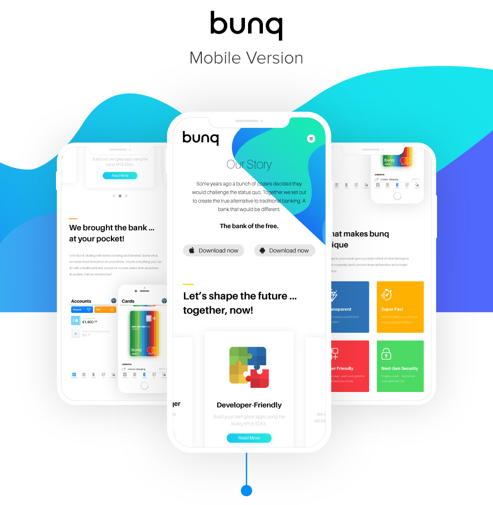
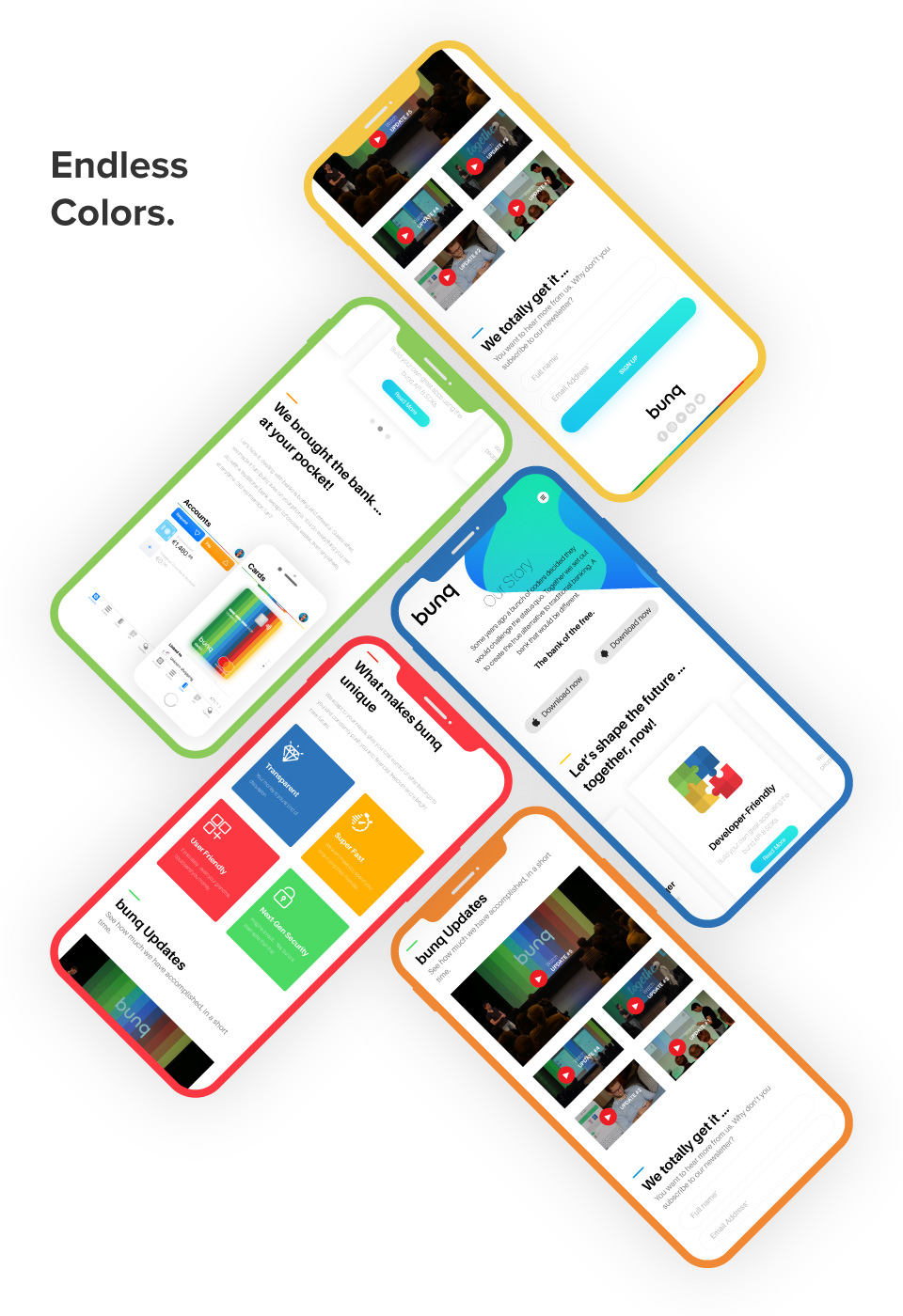
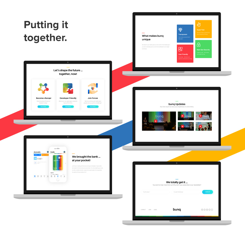
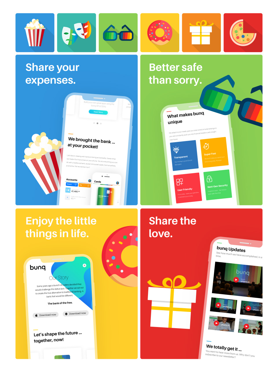
Grid Design: The majority of bunq users come from a mobile environment, so my approach was to start mobile-first. However, instead of building the mobile layout, I opted to design small elements and group them into modules and sections. Once the modules were in place, their portability to PC, mobile and tablet layouts was a breeze. The grid system helped me arrange all the pieces effortlessly.

White Space: Play with a lot of colors and the design might end up looking too “childish”, which is exactly what the image of a bank shouldn’t be. Problem is: bunq itself uses a lot of colors. The problem was solved by using plenty of negative space and neutral font colors.

Hard part is over.

Once all the elements were in place and the mobile design had been finished, adapting that design to PC was the easiest part, especially since everything was made up of independent modules, rather than wholes.

Iconography is king.

Icons had to play a big part in my redesign right from the start. They were not only responsible for maintaining consistency across all the devices, but also not to completely move away from “bunq” identity.

Illustrations

Illustrations were used across bunq pages to make the brand more cororful, fun and personal. The flat style seemed to be the perfect fit between the unconventionality of bunq and the serious image a bank should portray.